ClarkVision.com
| Home | Galleries | Articles | Reviews | Best Gear | Science | New | About | Contact |
Post Processing Advantages
by Roger N. Clark
| Home | Galleries | Articles | Reviews | Best Gear | Science | New | About | Contact |
by Roger N. Clark
Introduction:
Often digital photographers wonder what advantages are there in post processing raw digital camera files, versus just using the jpeg images the camera generates. Just what can post processing do for your images, and is it "cheating?"
Did you ever photograph with film? Color slides? Negative film? Black and white? In each case, one chooses the type of film for an effect. For example, high contrast slide film. Or maybe you want super saturated colors. Or maybe accurate colors. When printing, one has the choice of paper and development time. Look at the difference in a Cibachrome print versus more traditional papers. In black and white, the same choices are had with the film choice, then the developer, and then the print. One chooses the grade of paper for the effect.
Read the Ansel Adams book The Print.
Now to digital. You have little choice in contrast out of camera (less than one has with film types). The default characteristic curve of digital cameras is like that of a relatively boring low contrast print film. The dynamic range of a camera with large pixels (DSLRs) is huge: greater than can be printed or displayed. So the dynamic range in a digital camera image must be compressed to fit into the display medium. That means dodging and burning.
This gets back to Ansel Adams and The Print.
The bottom line is if you want your images to have impact, almost all will need post processing. This is nothing new; see Ansel Adams The Negative and The Print. Only the tools to get there have changed: wet chemical darkroom last century, to the computer this century.
This does not mean that all your images MUST have post processing; only those where you want to push limits. I'll show some examples on this page.
If you want that slide look, you'll need to boost contrast. But more important, digital camera images lack a toe in the characteristic curve. All film has a toe and there is an important perceptual issue here: images with no toe look flat and not like reality. This is due to a combination of the transform from original linear intensity to the nonlinear output media, whether print or LCD monitor, or CRT. So to make a better image, one must add a toe to the characteristic curve on all digital camera images.
Some people seem to think that the out-of camera image is the most natural. Truth is that the default characteristic curve that comes out of digital cameras uses a logarithmic algorithm invented over half a century ago to convert early vacuum-tube television camera output to compensate for the non-linear output of early televisions! It is a variable gamma function, and fortunately, it turns out produces generally reasonable images. But make no mistake, it is not reality, and does not mimic perception by our eyes.
Our eyes plus brain make a great set of contrast detection imagers that work over a very large dynamic range. You can see this difference in characteristic curves of film, digital cameras, and the eye in Figures 8 and 10 at Dynamic Range and Transfer Functions of Digital Images and Comparison to Film http://www.clarkvision.com/articles/dynamicrange2/ .
No print or monitor has the dynamic range that a good digital camera is capable of. So moderate to high dynamic range images from digital cameras need dodging and burning to fit that dynamic range into the range of the output media. And science tells us post processing is necessary to show a closer representation of the original scene. The images in Figures 1a and 1b illustrate this fact. Without any dodging or burning, we would see the image in Figure 1a, and not at all like that easily visible to people at the real scene. The image in Figure 1b is closer to the real perceived view.
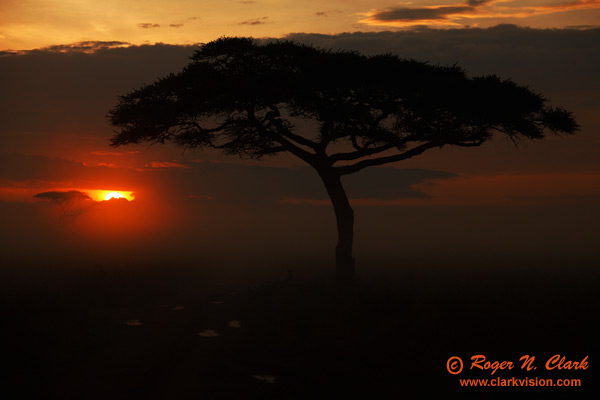
Figure 1a. Foggy Serengeti Sunrise, processed with no dodging or burning.

Figure 1b.
Foggy Serengeti Sunrise. This image is an example of a high dynamic range
image that can not be printed from the original out-of-camera
jpeg (e.g. as in Figure 1a). The foreground looks black in the jpeg
but was very dramatic viewing the real scene. In order to keep
the sun from being too overexposed, a fast exposure time was used.
Post processing brought up the low signal shown here. Even so,
the real scene view included a greater dynamic range and greater impact
than this image, although this image has reasonable impact.
First let's define post processing. My definition is: Contrast, color balance, dodging and burning to compress dynamic range, remove sensor dust specs, fix lens light fall-off, crop, and sharpen.
It does not include removing or adding things to the scene. I have an extensive statement on my web site regarding this topic, including more on the limitations of camera technology: http://www.clarkvision.com/galleries/photo-ethics.html .
Regarding the concept that people change bad photos into good ones is incorrect. While post processing can improve any photo, a bad photo is a bad photo. Bad light can't be changed to good light. Sure you can remove a stick or power line, but that won't change the basic quality of the photo. See my article on Lighting, Composition and Subject for examples of good and bad lighting.
Anyone who has added or removed a significant component in a high resolution image understands how difficult it is. Most realize it is far easier to get it right in the camera than to fix it later. So then when people see spectacular images, they ask if it was created in photoshop. Little do they realize the skill of the photographer. I see some of that attitude in this thread.
Methods
The methods I use for processing raw images is described here: http://www.clarkvision.com/articles/digitalworkflow/ .
Examples
The first example shows images of the Moon recorded with a 500 mm lens and stacked 2x and 1.4x TCs where both raw and in-camera jpeg images were recorded. The conversion of the raw file with done in Adobe Camera Raw with interpolation to a 25 megapixel image (the camera was 16 megapixels). The resulting images (jpeg and raw converted images) are shown scaled by the same amount in Figure 2.
Figures 3-6 shows 1:1 pixel views of the images. Note the difference in details. In each case the raw converted image shows significantly more detail.
Compare the top edge of the Moon in Figure 3. The jpeg image shows a cyan fringe on the edge of the Moon, but it has been largely corrected in the raw converted image. During the raw conversion, the fringing was identified as chromatic aberration and the software corrected that problem. Fringing is also seen in 6 on the right edge of the Moon in the jpeg image. Note also how much sharper the edge appears in the raw converted image.
Color differences. The Moon image was acquired with a white reference set to sunny. But transmission through the Earth's atmosphere turned the Moon slightly yellow. This is seen in the out-of-camera jpeg image, but during raw conversion, the color balance was corrected to be more neutral and how it was perceived by the eye.
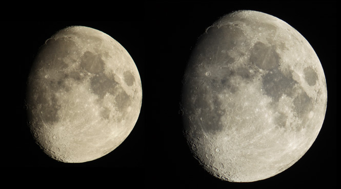
Figure 2. Examples of the same image. On the left is from
the in-camera generated jpeg with no post processing (except scaling the
image down to a smaller size for display). On the right
is an image generated from the raw file recorded with the
jpeg image.
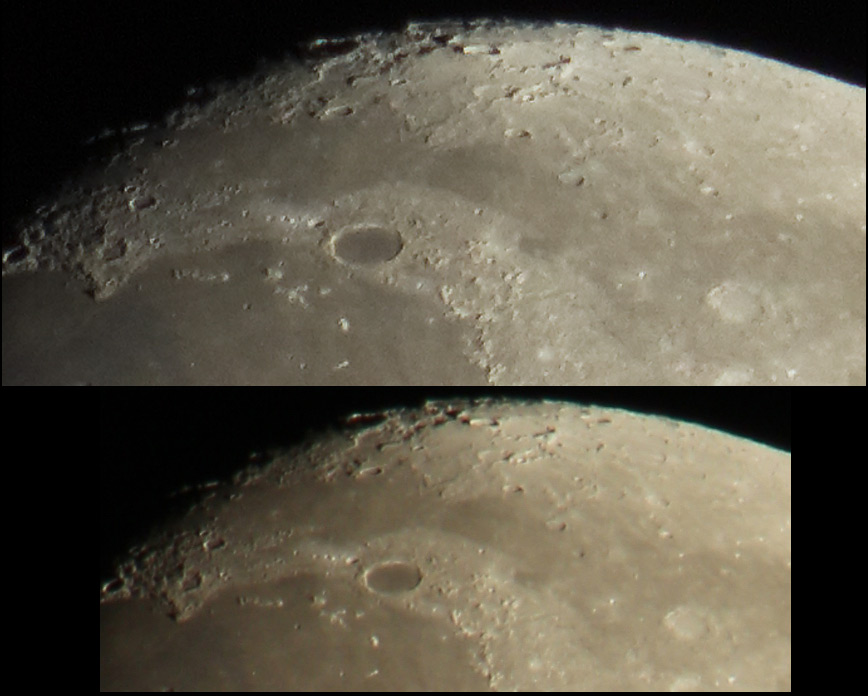
Figure 3.
Comparison of a moon image processed from the
raw file (top) and the in-camera generated jpeg image (bottom).
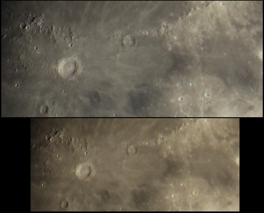
Figure 4.
Comparison of a moon image processed from the
raw file (top) and the in-camera generated jpeg image (bottom).
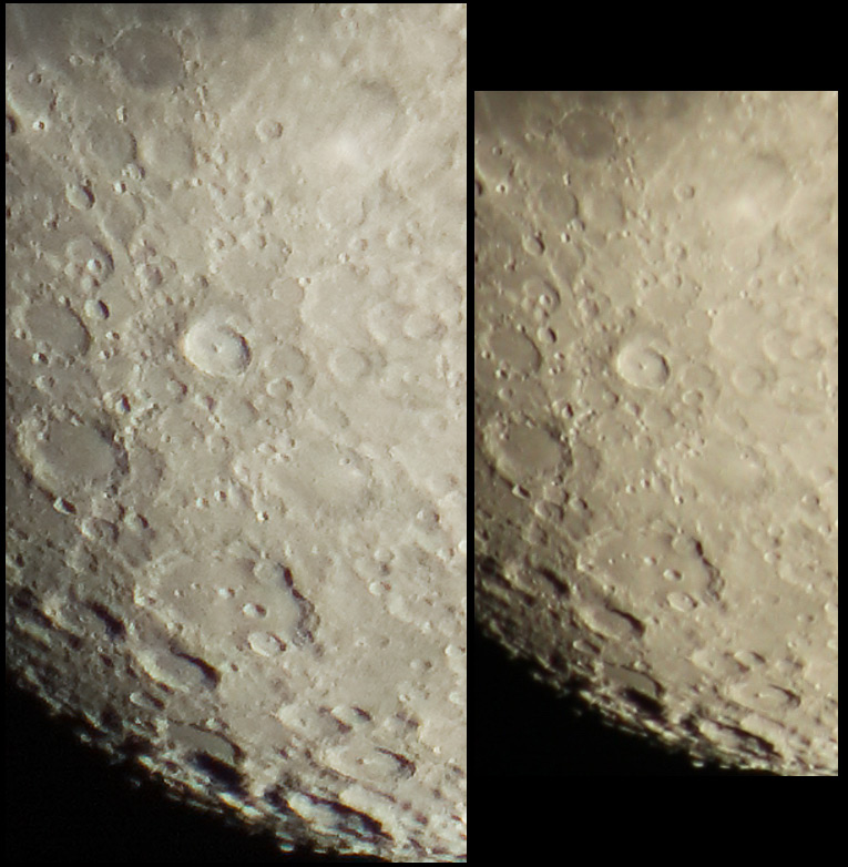
Figure 5.
Comparison of a moon image processed from the
raw file (left) and the in-camera generated jpeg image (right).

Figure 6.
Comparison of a moon image processed from the
raw file (left) and the in-camera generated jpeg image (right).
Example 2
How much post processing is acceptable to you? Some people saying some post processing is OK, some say any post processing is too much. The results below may surprise you.
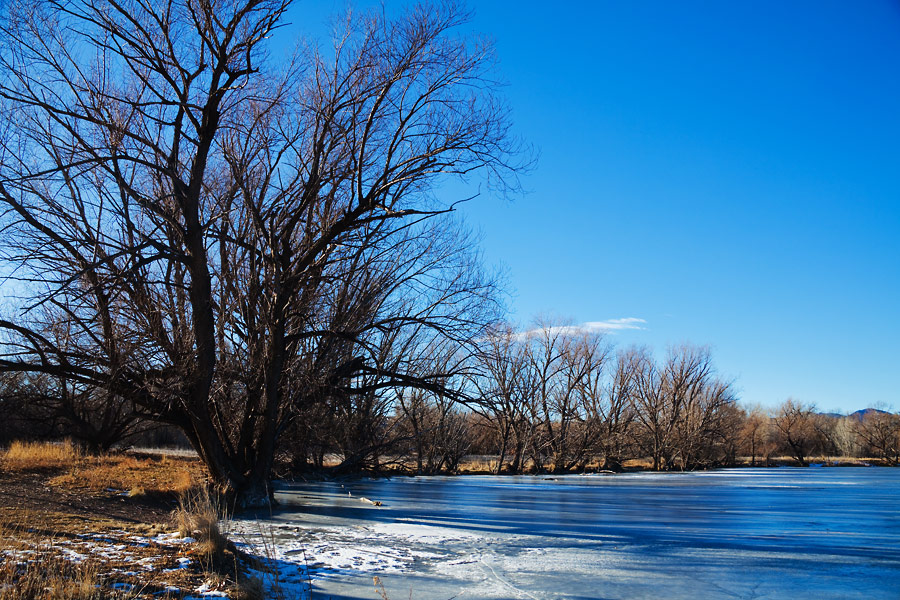
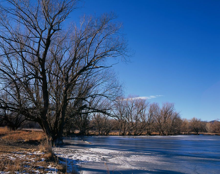
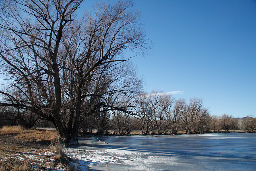
I've put together 5 images of the same scene, some from different cameras, and with varying levels of post processing.
Please look at the 5 images and rank them from best to worst, including not acceptable. Not acceptable could be either too flat or to contrasty/saturated.
If you have access to different computers, you might try looking at the images of different computers/monitors. I have found a very wide range in monitor contrast and saturation.
So, to be uniform in nomenclature, use the following ranking:
image # = 1, 2, 3, 4, 5, "NA too contrasty," or "NA too flat."
1=best, 5=least appealing. NA = Not Acceptable.
Images 1 - 5 in example 2 are not copyrighted for personal use. You may copy them to your computer, print them, or put them up on different monitors to view the differences in the images. Not for commercial use.


Now let's examine what others have said. Do the test before you scroll down to see the results from others.
Scroll down for results.
Comments from others:
Number five is unacceptable appearing too saturated and over-sharpened.
It comes down to number two and four. Oddly four looks sort of more natural, but I prefer the look of number 2.
Rankings assuming you are trying to reproduce the original scene accurately, rather than an image for a travel brochure!
Results of rankings from various people and monitors are given in Table 1. Note Not Acceptable (NA) was assigned a value of 6.
                         Table 1

    Viewer Rankings, Images Viewed on Computer Monitors

          Image
 1     2     3     4      5  monitor
-----------------------------------------------------------------
           Rank
-----------------------------------------------------------------
 6     2     1     3      6
 4     1     3     2      6  Viewsonic VX910 calibrated spyder 3
 6     1     3     2      6
 4     3     2     1      6
 3     2     4     1      6
 1     2     3     1      6  Gateway 24" calibrated
 1     4     2     3      6
 2     4     1     3      6
 2     3     1     6      6
 3     2     1     6      6
 2     3     1     6      6  imac 24 spyder calibrated
 6     3     1     2      6  dell laptop
 2     4     3     5      1
 3     2     1     6      4  laptop uncalibrated
 3     2     1     6      6  dell 30 calibrated spyder 3
 3     2     1     4      6  samsung 19 uncalibrated
 3     2     1     6      6  dell 30 uncalibrated
-----------------------------------------------------------------
3.18  2.47  1.76  3.71   5.59 AVERAGE
Guide to Example 2 images:
Images are from the same scene imaged by two different cameras:
A) 6x7 film camera with Fujichrome Velvia, ISO 50 and scanned on aa Epson V750, and
B) Canon 5D Mark II 21-megapixel digital camera at ISO 100, recording raw + in-camera jpeg.
Image 1: Straight scan from a 6x7 Fujichrone Velvia slide with no post processing.
Image 2: An attempt to make a 5D Mark II raw-converted digital image look like the Velvia image above. People ranked this image 2nd, on average.
Image 3: The 5D Mark II raw file processed to best represent the scene in my opinion. People ranked this image at the top, on average.
Image 4: 5D Mark II out-of-camera jpeg. People ranked this image 2nd from the bottom, on average. Many thought it was too flat.
Image 5: The Velvia scan from Image 1 post processed. People ranked this image at the bottom, on average. A clear majority ranked it as too saturated.
Note. I wonder how the rankings would be if the images were printed and compared as prints. I bet image 5 would rise in the rankings, and image 4 would be at the bottom.
The 6x7 Fuji Velvia images are from W. Baumgartner and the 5D Mark II images are from R. Clark. Again, example 2 images 1 - 5 are not copyrighted for personal use.
The results show several things. Saturated films like Fujichrome Velvia have higher contrast and saturation than heavily processed digital images. Out of camera digital images are look very flat. Post processing is necessary to correct digital camera images to make the image closer to the perceived view. Any one image has a large variation in saturation and contrast on different monitors.
Summary
Great photographs are determined when you press the shutter resulting in great images coming out of the camera. Post processing makes them better. Great images have great light with a great subject in a great composition. You can't change light or subject in photoshop.
But images from a digital camera are not necessarily reflective of what we saw with our eyes. The information is likely there in the image, but needs processing to bring it out for the viewer.
Post processing can include color balance, dynamic range compression to make the dynamic range that could be seen presentable on a print or computer monitor, sharpening, correction of camera aberrations, basic contrast corrections, and more. Of course post processing can be abused, but that is a decision by the user as with the use of many tools.
Some film images have very different response than digital. Digital camera images must be pushed in post processing quite a lot to come close to saturated films like Fujichrome Velvia. So if it is acceptable to produce images with film, it should be equally acceptable to post process digital camera files to mimic film if one wants to.
Finally, post processing images from a digital camera can improve sharpness and detail, correct color balance, fix dust spots and other image defects, like chromatic aberration from the lens and compress dynamic range for viewing the image on computer monitors or on a print.
| Home | Galleries | Articles | Reviews | Best Gear | Science | New | About | Contact |
http://www.clarkvision.com/articles/post_processing.1
First published September 19, 2010.
Last updated February 8, 2014